Fauna & Flora
UX DESIGN
Founded in 1903, Fauna & Flora is an international wildlife conservation charity. They work in over 40 countries to protect and restore habitats, save species from extinction and develop sustainable livelihoods for those living closest to nature.
The project
The project was a redesign of the Fauna & Flora website including UX, UI and content improvements to ultimately grow their supporters and donations.
I was invited to take over the UX role for 8 weeks. My consulting included prototyping, user testing and wireframing whilst working closely with the client and core internal agency team, consisting of delivery manager, content designer, UI designer and engineers.

Discovery, ideation + planning
Using the newly defined user journeys I ran a user testing ideas workshop to identify what we might like to test. We agreed on the top ideas and ideated how we might test them and what the research stimuli could be. Post session I collated everything into a report, refined the ideas further and recommended a user testing plan.
Prototyping
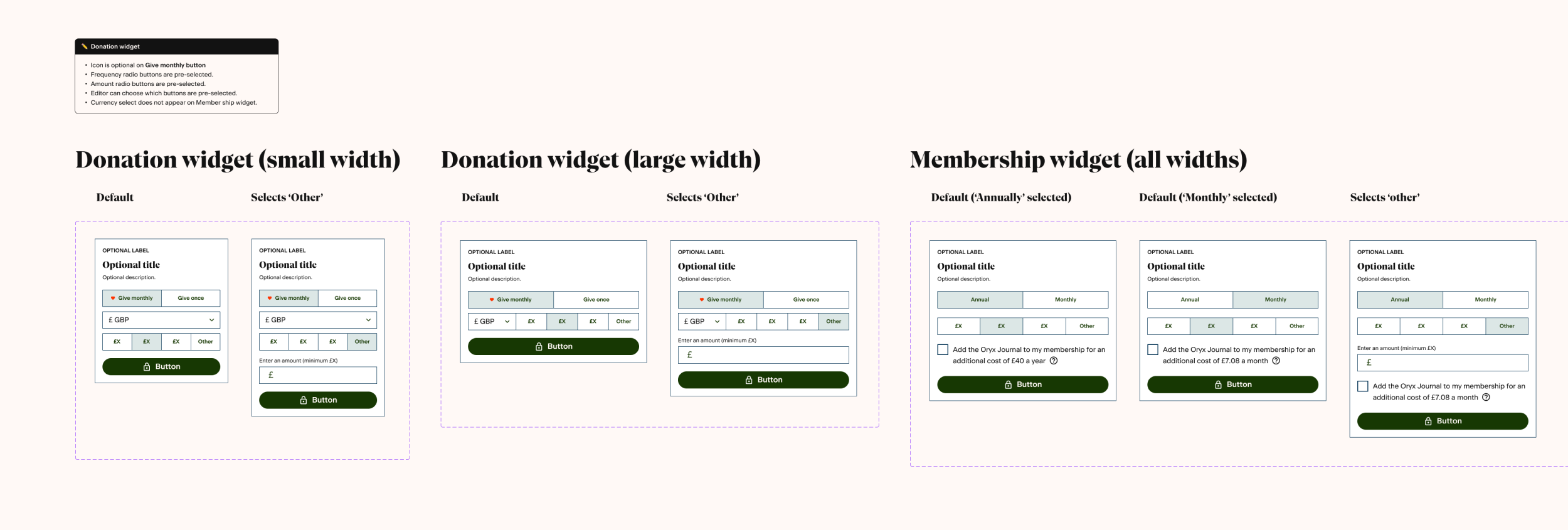
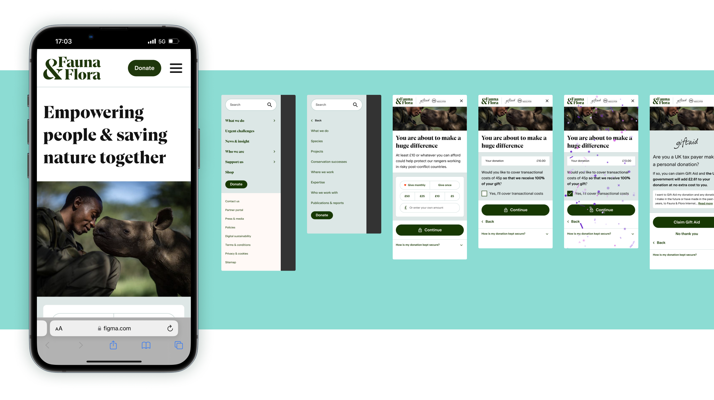
Creating a prototype meant we could test new content, components and journey experience. Using figma, I designed and developed an interactive mobile screen size prototype consisting of the homepage, mobile menu and full donation journey.
User testing
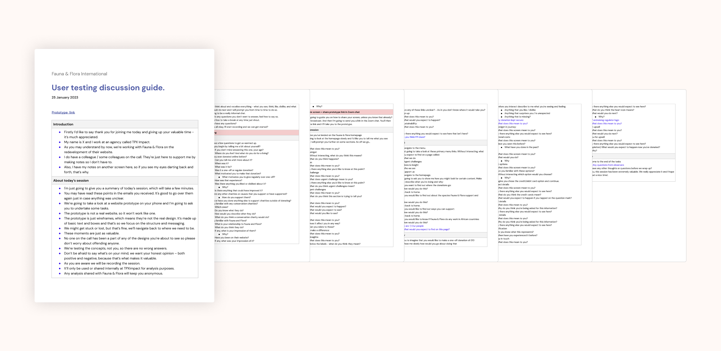
I ran remote one hour user interview sessions using Zoom. By pre-instructing participants to join the call using their smartphone we were able to converse via video and then use screen share so that I could view their screen whilst they used the prototype.
Analysis
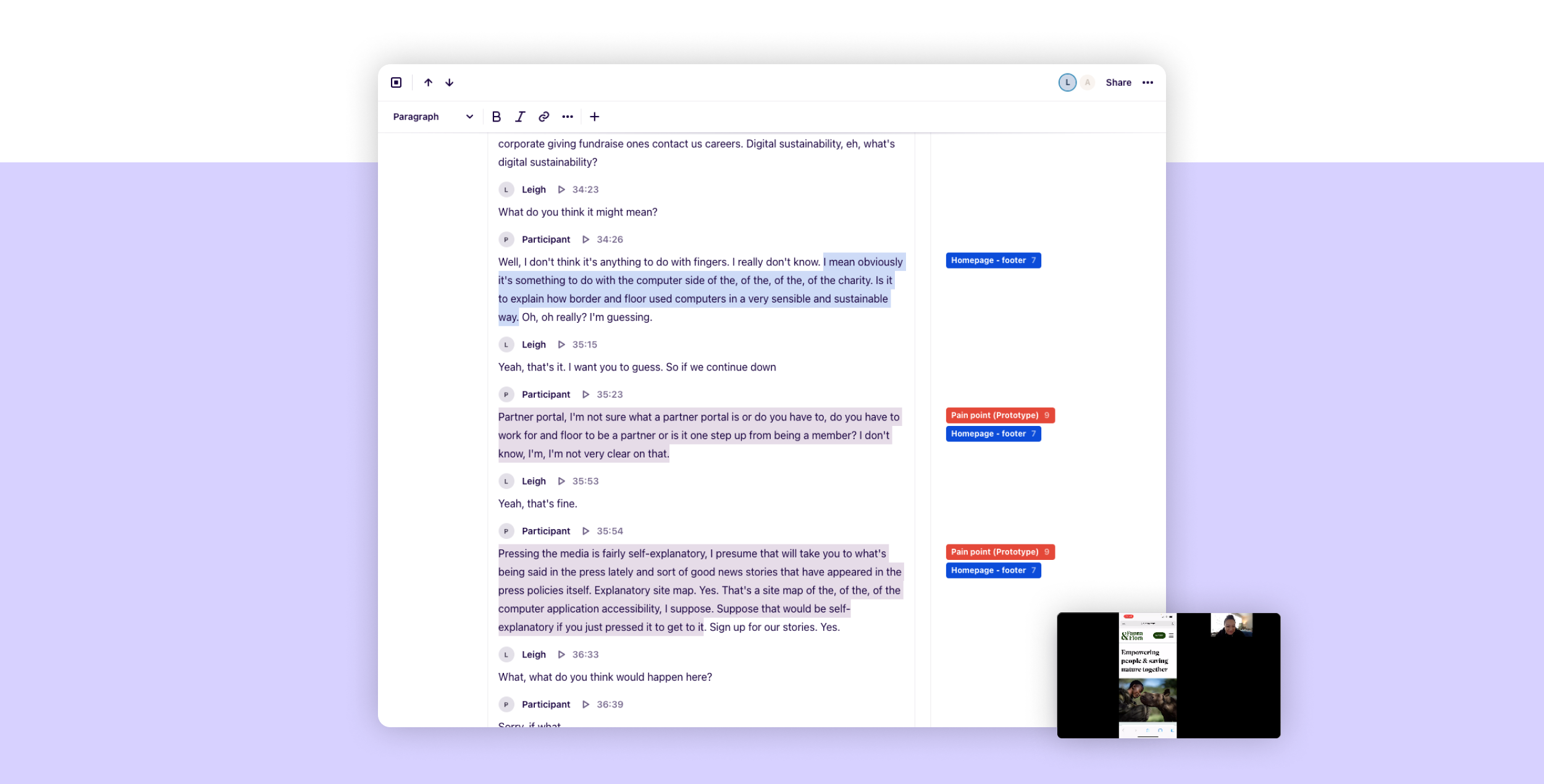
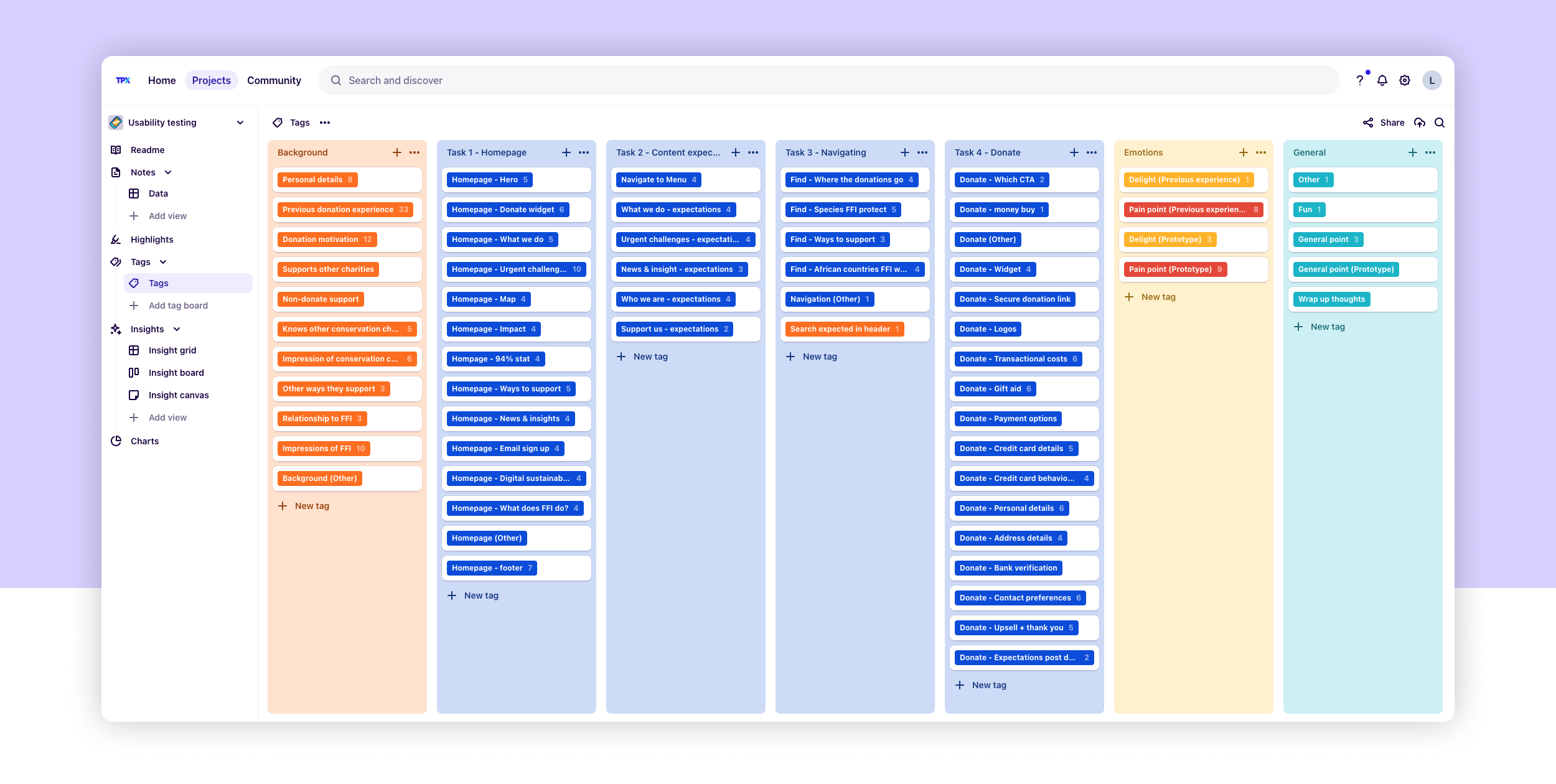
The sessions were recorded and uploaded to the platform Dovetail, in which I was able to transcribe, tag quotes by theme or topic and identify insights.
Insights + recommendations
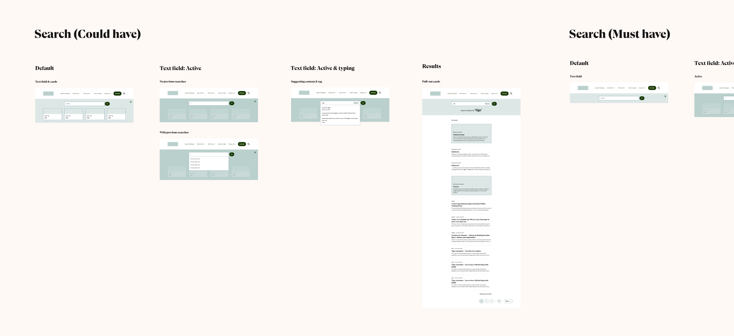
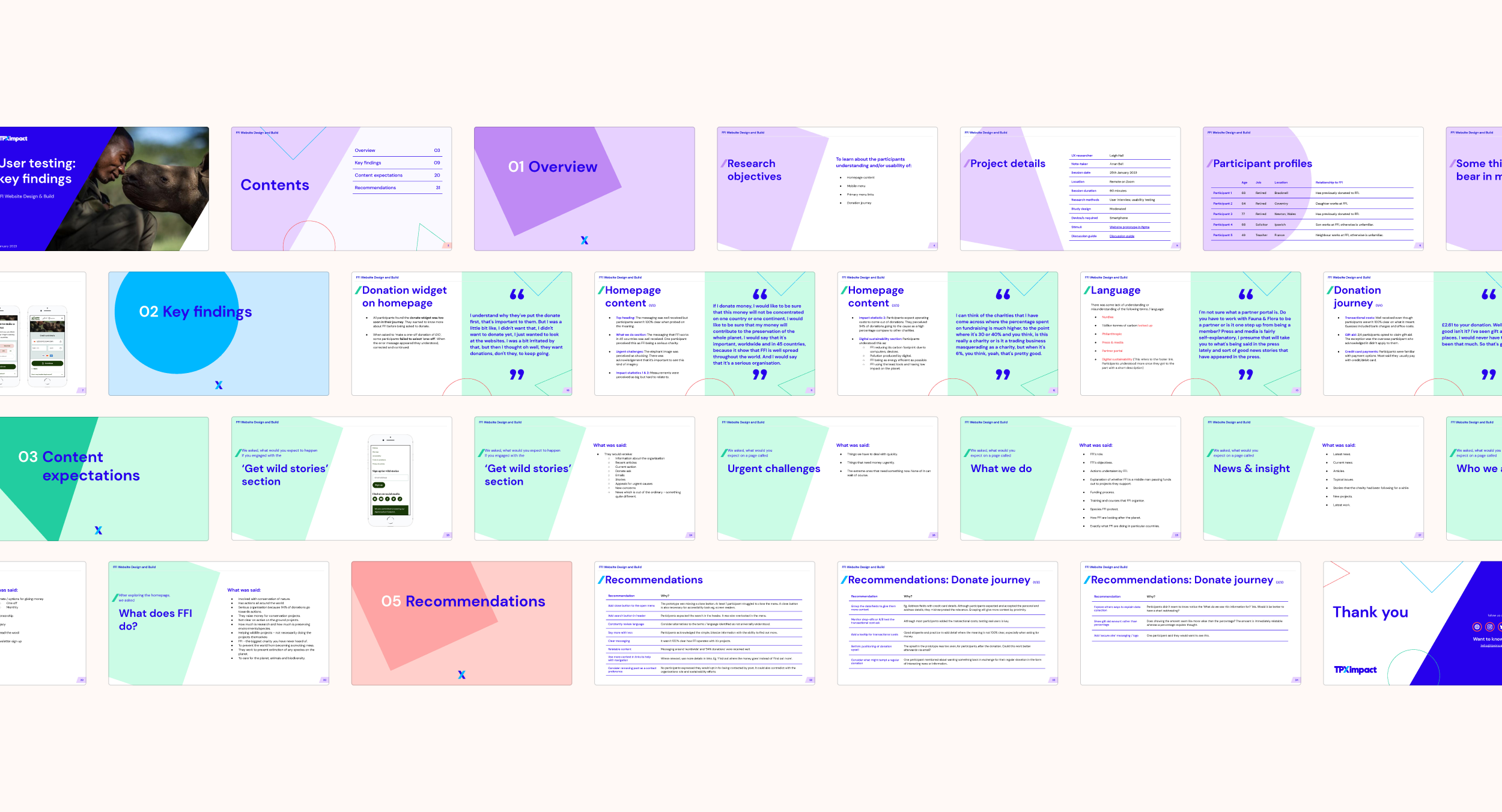
The insights enabled us to make some valuable developments to the wireframes and some solid recommendations towards language and content. Interesting insights included the value display of gift aid, upselling and the positioning of search.
Wireframes
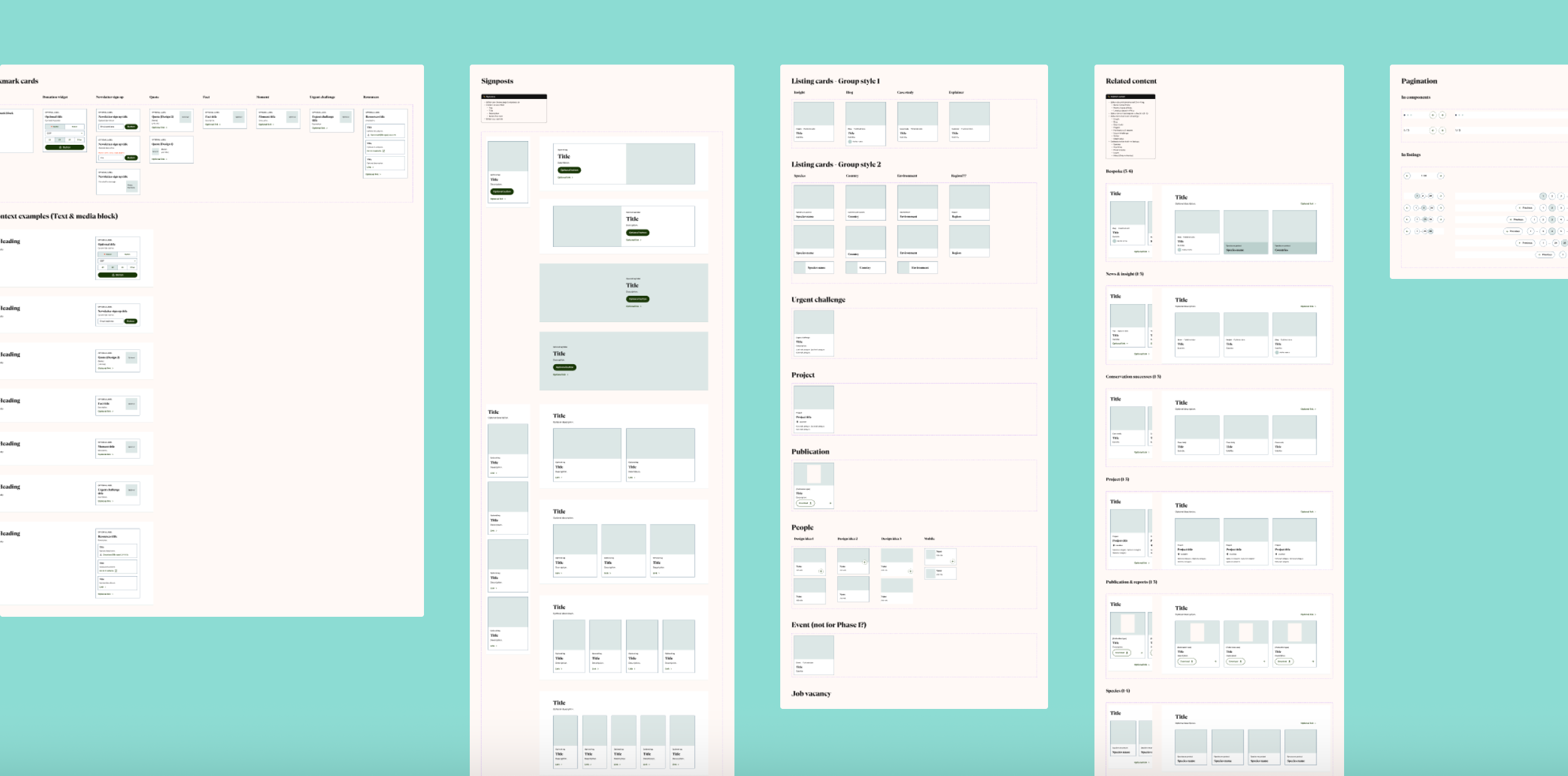
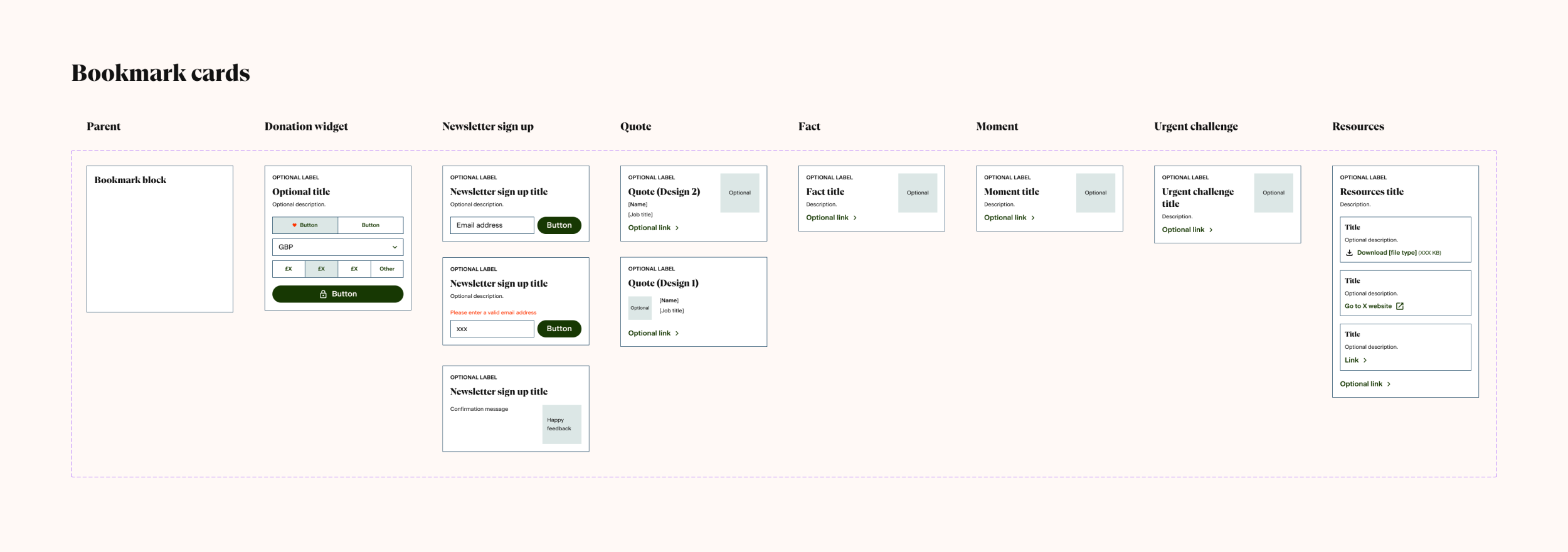
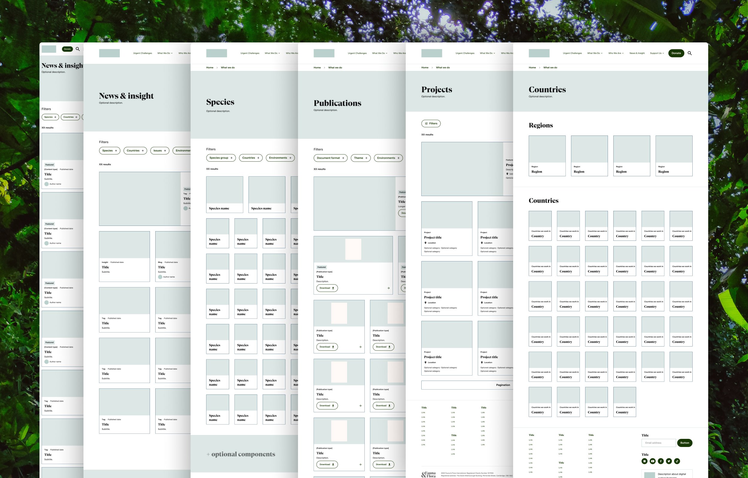
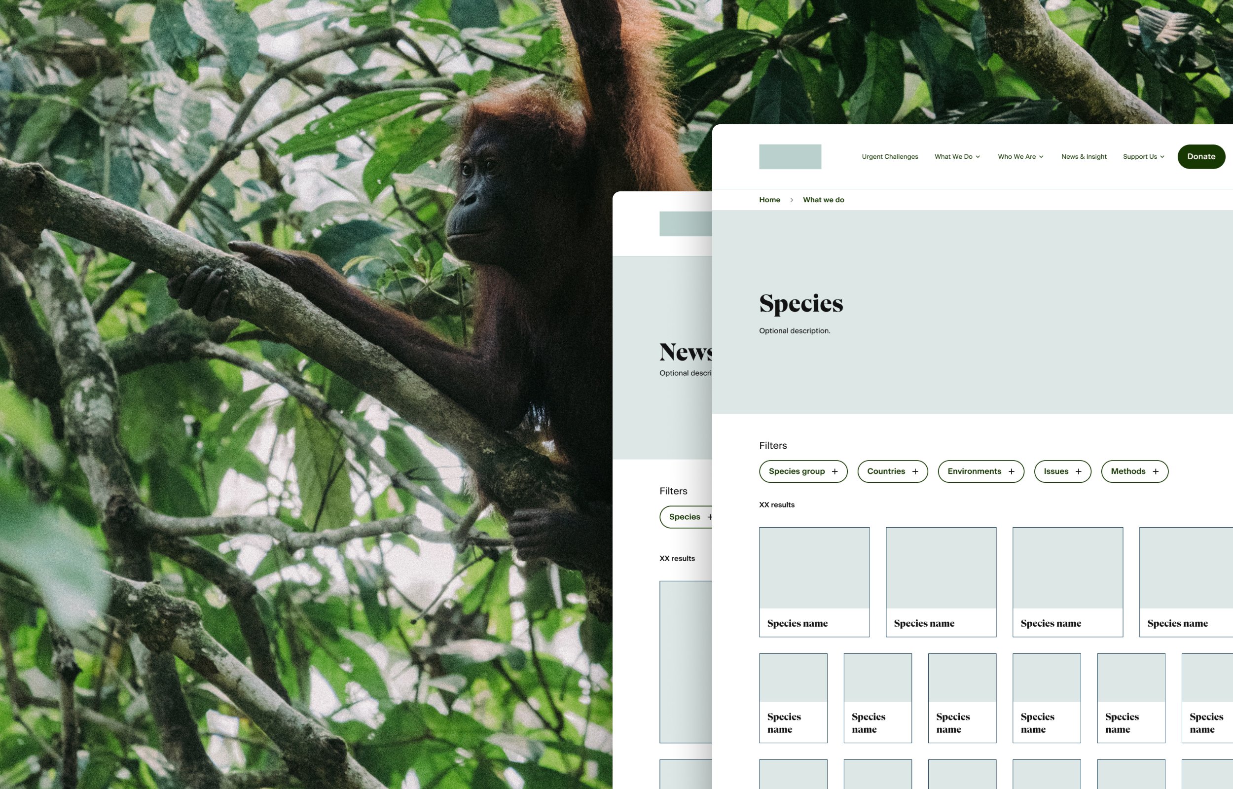
I designed a library of responsive wireframes: components, pages and journeys including search, donate, navigation, cards and listing pages to name a few.
With limited time, it was crucial to identify the key components, prioritise and ensure flexibility. Creating a matrix to checkbox elements and components against pages helped with efficiency and documentation. Above all, ensuring a close working and reviewing process with the client, UI designer and engineers was paramount and, I’d say, was pretty successful by the sheer amount we achieved!
